
You’ve most definitely heard the saying “don’t judge a book by its cover.” While everyone wishes that were true, it’s unfortunately not the case in most situations. A lot of the time, book readers who are looking for something new to read will be looking at the cover and it will sway them towards or away from a book for one reason or another. The book cover is basically the first impression present in the book world. Before your reader even sees the blurb of your book or even sees the first page, they will see the book cover. So, here’s why your book cover design matters and how to make sure yours is the best it can be.
The First Impression Matters
As humans, we tend to be visual. We process images first and the ability of using a visual medium to deliver a message is something that we’ve seen since the beginning of human history. We just tend to notice the visual things before the text, which is why it’s important to spend time with your book cover and to think about what you’re putting in front of readers.
A book with a well-designed book cover will likely get people to click or pick up more than books with lower-quality covers. However, do understand that just because your cover is great doesn’t mean that it will appeal to all audiences. Some audiences of readers want darker, more gritty covers and others want lighter, more happy covers.
The book cover is the first impression your customers will have when it comes to your book, so you really need to make sure that you are honing in on your cover and that your readers will find it appealing so that they can make it to the first page, which is the most important page of your book.
Marketing and Branding
Another big part about why your book cover design actually matters is that it’s going to be at the forefront of your marketing campaign. When a reader wants to find a book to read, they’re not looking for anything more than what your book is, what it’s about, what the cover looks like, etc…
When you go to promote your book, chances are, the cover will be the biggest thing that you will be showing off in your marketing materials. This will be important because people will recognize your book from the cover. The cover is basically a big part of the visual branding and identity of your book.
Furthermore, the elements of your book cover will tell the audience of readers if your book appeals to them or not. If I’m looking for a book and I see that the cover features swords and shields, I assume it’ll be some sort of fantasy book. If I see a cover that has guns on it, then I’m thinking a thriller or military fiction. Colors and typography are also really important for a book cover design and they matter with readers.
What Makes a Book Cover Click With Readers?
Imagery and Color
One of the first things that the reader will see is whatever images and colors you have opted to use in your book cover. Color is really the first signal and makes a reader enticed to pick up a book. If I personally see a cover that has lots of red and bright colors like that, I’m more likely to find myself intrigued about what it is. The image is also a big deal with your cover.

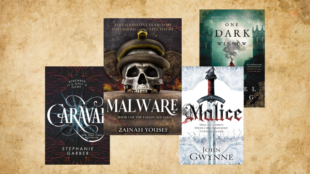
As you can see above, this is the new and updated cover I’ve chosen for Malware and the image is immediately something that if I were in a bookstore, would get me intrigued. I find the imagery of a skull and a snake as well as flames and a mask to be interesting because this indicates to me the tone of the book. It’s clearly dark, and I don’t need to flip through the pages to figure that out.
Typography
Typography is a big deal in all graphic design and it’s also a big deal when it comes to your book cover design as well. The typography basically refers to the font choices you use for your text on the cover. This includes the title, subtitle, name, etc… The choice of font you use is actually important because it can convey something about the book inside of the cover. A book that has a more flowy and cursive-based font will not indicate the same as a book with a more blocky, bold font.
Placements
The way things are placed on your cover also matters quite a lot and this is something that you learn about in graphic design quite often. Basically, the placement of your title, the imagery, the colors and more all matter when you’re trying to entice readers to look at your book. You need to have a focal point or something that immediately catches reader attention and around it should be the other elements.
Here are a few covers below. Try to do this yourself:
- What’s the focal point?
- What are the major colors?
- What genre do you think this cover is for?

Uniqueness
Although it’s good to take inspiration from what other covers in your genre are like, you should try and be unique to your own story. You want to include elements and things that make sense for your story and help your book cover stand out from the crowd.
The Book Cover Can Affect Sales
“Shelf Appeal”
You might’ve heard of the idea of “shelf appeal” before and basically, shelf appeal is the idea that your book can stand out on a shelf and reach out to readers who are interested in buying books at a particular point in time. This applies to the digital stores as well like Amazon.
The idea is that your cover is the first thing a customer will see and if it looks interesting, then it’s more likely to be picked up, which means that it has shelf appeal. After that, it’s up to you to sell your book to readers through things like the blurb on the back of your book and the first page of your book.
The Internet
Since the pandemic in 2020, I’ve noticed more and more people are opting to buy books online instead of going to in-person bookstores. Now, I have noticed that people are trickling back to bookstores, but at the end of the day, we cannot deny the convenience of the internet and the way it has impacted sales of books.
When you go to Amazon and you browse for books, you might be looking up certain keywords and from there, you’ll get some covers and titles to read. You don’t know anything else about this book other than what the cover actually looks like and what the title is. This is why your book cover design is important: Other than the title, like I’ve said before, it’s the first impression your reader gets.
A bad cover will hurt your chances of being sold which will hurt your chances of discovery and potential popularity.
How to Design a Book Cover
If you want to learn how to design a book cover, you can take courses, watch YouTube videos, browse popular books and note what works/what doesn’t work and more. From there, you want to actually design the book cover.
There’s not really much I can say here, but I can tell you that it’s going to require quite a lot of time and work because it’s not a super easy task. I’ve compiled a list of the best book cover design tools out there so you can go check that out to get started.
Conclusion
When it comes to a book cover, the way you actually design it matters quite a lot in the context of the way customers perceive your book and the way your book actually sells. Contrary to the popular saying, a lot of people do judge books by their cover, and the visual component of a cover is super important because it is the first impression and the first way a reader interacts with the story. You want to create your cover based on the genre, the content, the age range, the target audience, the story itself, and other factors that will impact reader perception of your book.
Before you head on out, be sure to check out my series, The Fallen Age Saga, and don’t forget to sign up for my newsletter to get more information on all the latest posts, updates on my WIPs, book releases, and more!